NOMA BRANDING
Ceramics as a system of research
Editorial Design

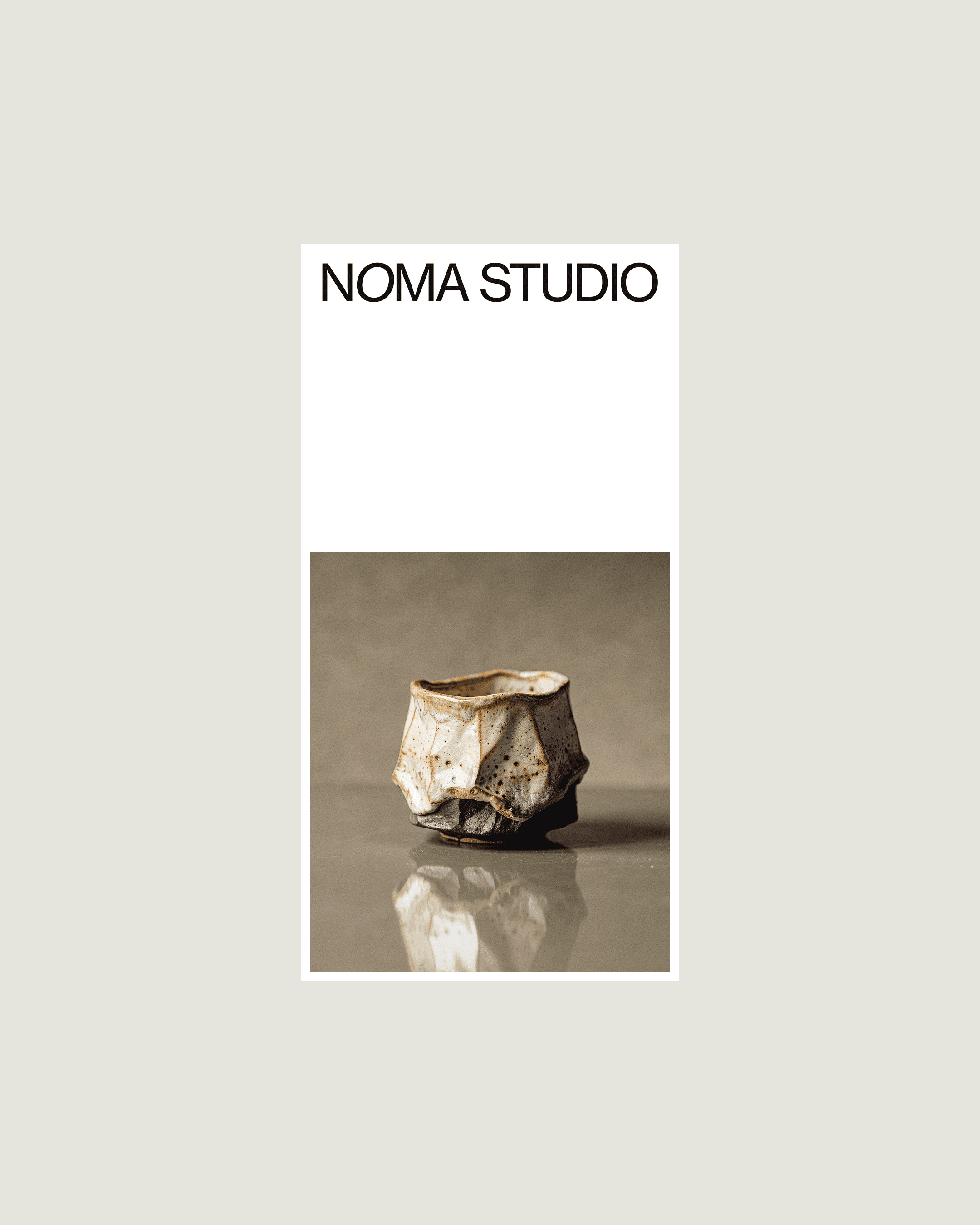
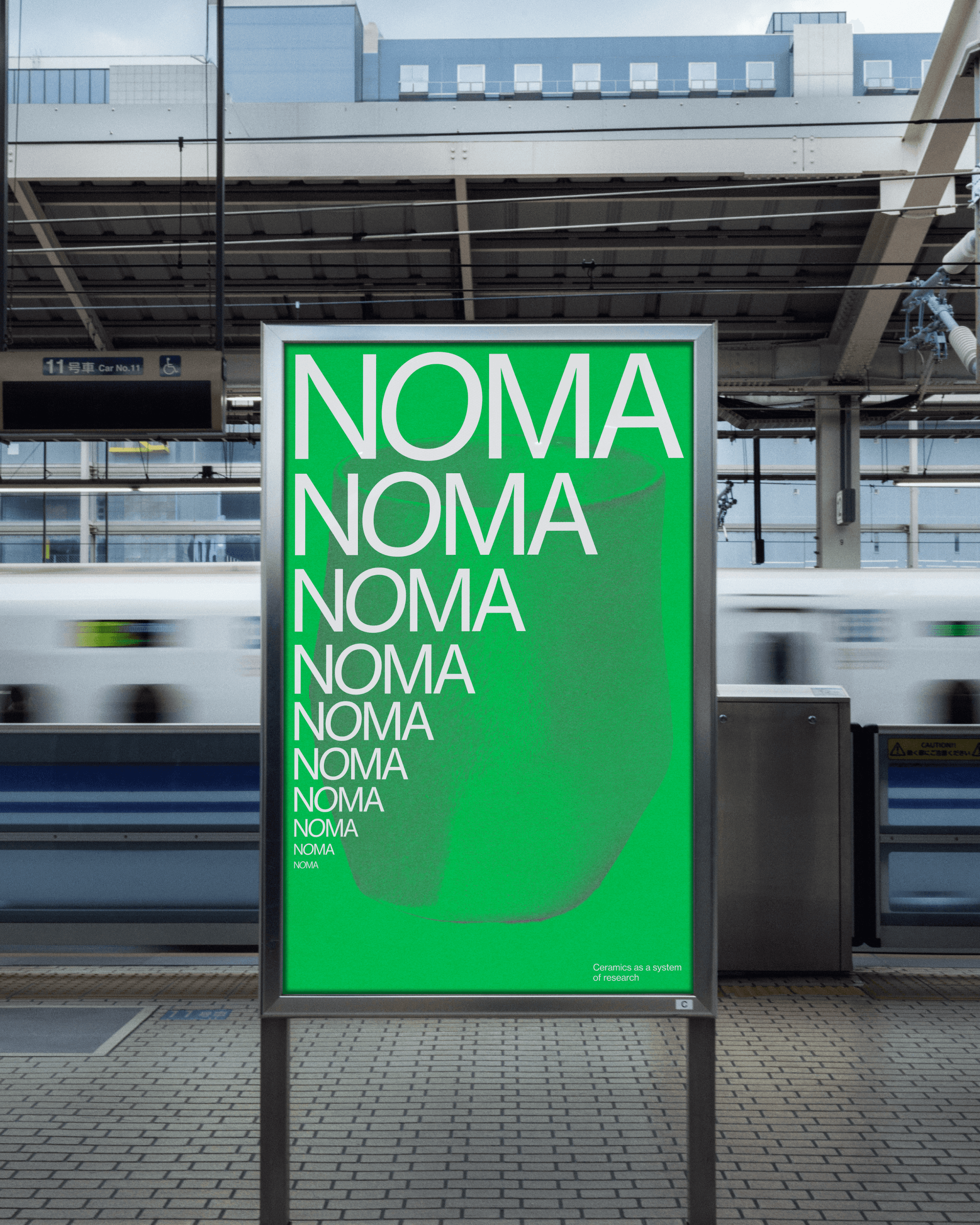
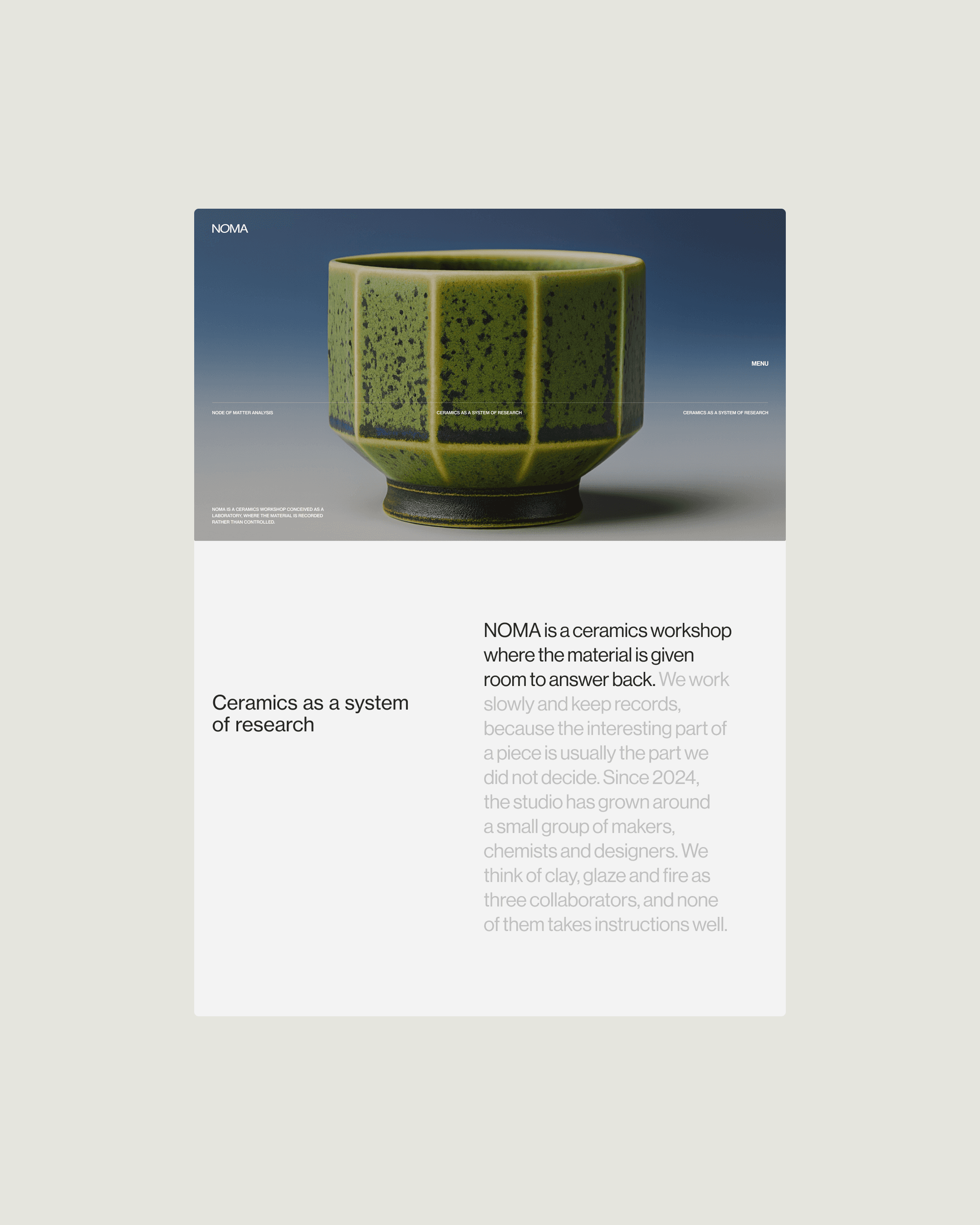
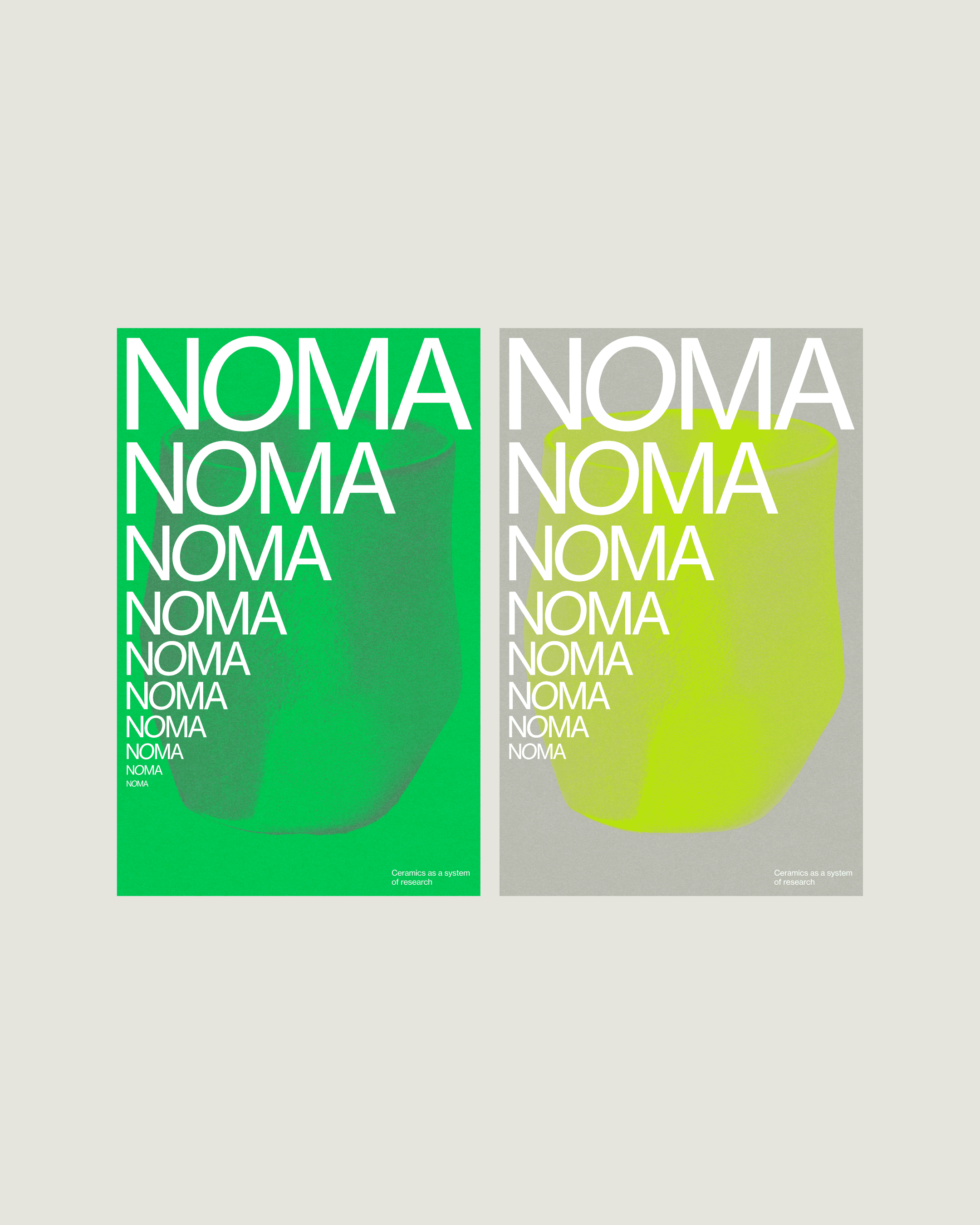
Noma is a ceramics workshop. Every piece is thrown and glazed by hand, so no two come out the same. Most workshops hide that. NOMA treats it as the method. That set the problem. The identity had to hold hundreds of one-off objects without flattening them into a product line, and without the craft-market look that makes every ceramics brand read the same. So we built a fixed frame with a loose interior. One typeface, a strict grid, a palette pulled from unglazed clay. The name repeats down a poster until it stops reading as a word and starts reading as texture. The site works the same way. The layout never moves and the images change completely from one scroll to the next.
Client
Playground
Sector
Branding
Project Team
Sinrencor
Related Projects